The Language of Active Markets
The Vocabulary Every Trader Needs to Know
From bulls and bears to short positions and price data, the essential terminology that unlocks your understanding of how markets really work.
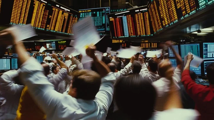
There is a moment that almost every new trader experiences — usually somewhere in the early days of reading charts or following a financial news programme — when the language simply stops making sense. Someone describes the market as “bullish,” a commentator warns that traders are “going short,” a screen flashes with numbers labelled OHLC, and the whole thing begins to feel impenetrable. It is a disorienting experience, and an unnecessary one. The terminology of financial markets is not designed to exclude newcomers. It evolved organically over centuries of trading, borrowing from folk proverbs, animal imagery, and practical shorthand invented on the floor of exchanges long before digital platforms existed. Once you understand where these expressions come from and what they actually mean in practice, the fog lifts remarkably quickly. This article works through the core vocabulary of market trading — not as a dry glossary, but as a connected account of the language itself.
The Bull and the Bear
Few phrases in finance are more recognisable than “bull market” and “bear market,” yet their origins are genuinely surprising. They did not begin as descriptions of whole economies or broad market trends. They started as labels for individual traders — and the bear came first.
The term “bear” entered financial vocabulary in early eighteenth-century London, drawn from an old proverb warning that it was unwise to “sell the bearskin before one has caught the bear.” By around 1709, the word was already being used in financial writing to describe a speculator who sold stock he did not yet own, hoping to buy it back at a lower price before delivery was due. The South Sea Company bubble of 1720 — during which speculators borrowed heavily to buy stock in a British joint-stock company that had assumed much of the national debt, only to see prices collapse catastrophically — brought the term into widespread use and embedded it firmly in financial language. Thomas Mortimer’s 1761 book Every Man His Own Broker codified the expression further, describing “selling the bear” as shorthand for what we now call short selling. The bear’s fighting style provided the metaphor: when a bear attacks, it swipes downward with its paw — a movement suggesting falling prices.
The bull followed shortly afterwards, representing the opposite stance: a speculator who bought stock in expectation of a rise, often on credit, planning to sell at a profit later. The bull’s charge — horns thrusting upward — became the natural counterpart to the bear’s downward swipe. Both images gained further resonance from a popular and grim form of entertainment in eighteenth-century England: bear-baiting and bull-baiting, blood sports in which large dogs were set against chained animals. Observers of these bouts noted the distinct fighting styles of each creature, and the imagery was gradually absorbed into the vocabulary of commerce.
The modern definitions crystallised slowly. Charles Dow, co-founder of the Wall Street Journal, wrote in 1902 that it was a bull period “as long as the average of one high point exceeds that of previous high points,” and a bear period when the opposite was true. A precise threshold of twenty per cent — a market is considered to be in a bear when it has fallen at least twenty per cent from recent highs, and a bull when it has risen at least twenty per cent from recent lows — did not take firm hold until the 1950s and 1960s. Today, those definitions are standard, though the spirit of the terms remains what it always was: the bull represents optimism and upward momentum; the bear represents caution, pessimism, and declining prices.

In practical terms, a bull market is characterised by rising asset prices, strong investor confidence, growing corporate earnings, and low unemployment. The longest bull market in modern history ran from March 2009 to February 2020, as the global economy recovered from the financial crisis and low interest rates kept capital flowing into equities. A bear market, by contrast, creates a very different mood. The dot-com collapse of 2000 to 2002 saw the S&P 500 fall approximately forty-nine per cent from its peak. The global financial crisis of 2007 to 2009 took it down by around fifty-seven per cent. These are not minor fluctuations — they represent extended periods during which the entire financial landscape contracts and investor psychology shifts from confidence to fear.
The terms “bullish” and “bearish” are also used to describe the outlook of individual traders on a specific stock or sector, not just the market as a whole. A trader who believes Barclays shares are undervalued and expects them to rise is said to be bullish on Barclays. A trader who believes a particular sector is overextended and due for a correction is taking a bearish view. The same language applies whether someone is discussing a single company, an index like the FTSE 100, a currency pair, or a commodity such as crude oil.
Trend, Momentum, and the Sideways Market
Closely related to the bull and bear distinction is the concept of a trend — the general direction in which a market or an individual asset is moving over a defined period of time. Understanding trend is foundational to almost every approach to trading, because markets reward those who move with prevailing momentum and frequently punish those who fight it. There is an old trading maxim — “the trend is your friend” — that is often repeated precisely because it is so frequently ignored.
An uptrend is defined technically as a pattern of higher highs and higher lows: each peak exceeds the previous peak, and each trough sits above the previous trough. This structure shows that buyers are consistently willing to pay more, and that sellers are not yet in control. A downtrend is the mirror: lower highs and lower lows, with sellers dominating and buyers retreating. Both types of trend can operate across different timeframes simultaneously — a stock might be in a short-term downtrend during a correction while remaining in a longer-term uptrend over months or years. The timeframe through which a trader views the market is therefore as important as the trend itself.
The third type of trend — one that causes no end of frustration for traders who rely on momentum — is the sideways trend, sometimes called a ranging or consolidating market. In a sideways market, price moves back and forth between a ceiling (resistance) and a floor (support) without committing to a clear direction. Some experienced traders argue that markets spend as much as seventy per cent of their time in some form of consolidation, trending decisively only the remainder of the time. For trend-following strategies, this creates what traders call “death by a thousand stops” — the market whipsaws back and forth, triggering stop-loss orders repeatedly without ever delivering a sustained move to profit from.
Trend analysis is supported by a range of technical tools: moving averages that smooth out short-term noise to reveal the underlying direction, momentum indicators such as the Relative Strength Index (RSI) and Moving Average Convergence Divergence (MACD), and trendlines drawn across successive highs or lows to define the structure visually. None of these tools predicts the future with certainty. What they do is help a trader read what the market is already doing — and make decisions that align with that reality rather than against it.
Higher Highs, Higher Lows
Buyers are in control. Each successive peak and trough sits above the previous one, confirming upward momentum. Trend-following traders look to buy pullbacks within this structure.
Lower Highs, Lower Lows
Sellers dominate. Each successive peak and trough sits below the previous one. Short sellers look to profit from this structure; long traders typically stand aside.
Range-Bound Price Action
No clear directional commitment. Price oscillates between defined support and resistance levels. Range traders buy the floor and sell the ceiling; trend traders wait for a breakout.
Long and Short: The Two Sides of Every Trade
Every transaction in a financial market involves someone who is long and someone who is short. Understanding this distinction — and grasping why a trader might deliberately want to be on the short side — is one of the more counterintuitive but essential lessons in trading. It is also, it should be said, one that takes a little time to sit with. The concept of making money from falling prices feels unfamiliar at first, but it follows a logic that is entirely straightforward once the mechanics are clear.
Going long is the most natural form of trading. When you go long on a stock — say, shares in a FTSE 100 company like HSBC — you are buying those shares in expectation that their price will rise. Your first action is to buy; your second action, when you choose to exit the position, is to sell. The profit or loss is determined by the difference between your entry price and your exit price. This is how most people instinctively think about investment: buy low, sell high.
Going short — or “shorting” — reverses that sequence entirely. A trader who goes short believes a stock’s price is too high and is likely to fall. To profit from that expectation, they borrow shares from a broker, sell those shares immediately at the current market price, and then wait. If the price falls as anticipated, they buy the same shares back at the lower price and return them to the broker, pocketing the difference. The sequence is: sell first, buy back later. This is the same logic as the old folk expression embedded in the word “bear” — selling the bearskin before you have caught the bear.
How Short Selling Works
The five-step sequence from borrowing shares to pocketing the profit
Borrow shares
from your broker
Sell at market price
while the price is high
Price falls
as anticipated
Buy back cheaper
at the lower price
Return shares & keep profit
difference is your gain
e.g. £10.00 per share
e.g. £7.50 per share
£2.50 per share (less broker fees)
△ Key risk — If the price rises instead of falls, losses are theoretically unlimited. A share can only fall to zero — but can rise without bound.
Source: Signals & Sentiment. For illustrative purposes only. Figures shown are hypothetical examples.
The risk profile of a short position is fundamentally different from a long one, and this is worth understanding clearly. When you go long on a stock, the worst that can happen is that the share price falls to zero — your maximum loss is your initial investment. But when you go short, your potential loss is theoretically unlimited. There is no ceiling on how high a price can rise. A stock that you have shorted at £10 can, in principle, trade to £50, £100, or beyond — every pound of increase is a pound of loss on your position. This asymmetric risk is why shorting is generally considered an advanced strategy and why risk management is particularly critical when trading the short side.
Short selling also carries a distinctive market risk known as the short squeeze. When a heavily shorted stock begins to rise unexpectedly — perhaps due to better-than-expected earnings, a takeover bid, or simply a shift in sentiment — short sellers rush to close their positions by buying the stock back. This surge of buying pushes the price higher still, forcing more short sellers to cover, which pushes the price higher again. The feedback loop can be savage. The GameStop episode of January 2021 became the most celebrated recent example of this phenomenon, as retail traders organised on the Reddit platform r/WallStreetBets bought shares aggressively in a heavily shorted stock, forcing a short squeeze that sent the price from around £4 to nearly £500 within days, inflicting enormous losses on institutional short sellers in the process.
In the UK, retail traders cannot typically short individual stocks in the traditional sense — borrowing shares requires an institutional brokerage relationship that is not generally accessible to private clients. Retail short sellers most commonly access downside exposure through derivatives: Contracts for Difference (CFDs) and spread bets, both of which allow a trader to take a position on falling prices without physically borrowing shares. Both instruments are available from UK-regulated brokers, though both carry leverage and require careful risk management. The Financial Conduct Authority mandates prominent risk warnings on such products precisely because many retail traders lose money when using them without adequate preparation.
Long vs Short — A Summary
Long position: Buy first, sell later. Profit if the price rises, loss if it falls. Maximum loss is your initial investment. The natural direction for most retail investors.
Short position: Sell first, buy back later. Profit if the price falls, loss if it rises. Maximum loss is theoretically unlimited — prices can rise without bound. An advanced strategy requiring strict risk management.
Square off: The act of closing an existing position, regardless of direction. Squaring off a long means selling. Squaring off a short means buying back. In both cases, you are simply exiting, not opening a new position in the opposite direction.
Open, High, Low, Close — The Anatomy of a Price Bar
Every time you look at a trading chart, you are looking at summarised versions of a story that played out in real time. Each bar or candle on the chart compresses the price activity of a defined period — a minute, an hour, a day, a week — into four data points: the open, the high, the low, and the close. These four figures are collectively referred to as OHLC data, and they are the raw material from which almost all technical analysis is built.
The open is the price at which the first trade of the period was executed. For a daily chart of a FTSE-listed company, this is the price at which the stock traded when the London Stock Exchange opened at 8:00 am. The open is set by the interplay of buy and sell orders that have accumulated overnight — pending orders, news responses, and pre-market sentiment all feed into where the price starts when trading begins. A gap between the previous day’s close and today’s open — what traders call a “gap up” or “gap down” — tells an immediate story about how the overnight news or sentiment has changed things.
The high and low mark the extremes that price reached during the period: the highest price any buyer was willing to pay and the lowest price any seller was willing to accept. The distance between the high and the low — known as the range — reflects the level of activity and volatility during that period. A wide range suggests significant movement; a narrow range suggests that buyers and sellers were in close agreement throughout. On a candlestick chart, the high and low are represented by the thin lines above and below the body of the candle, which traders call the upper and lower wicks or shadows.
The close is arguably the most important of the four figures. It represents the final price at which the market traded during the period, and it carries particular weight because it reflects the net verdict of all the buying and selling that took place. Traders who study candlestick patterns — a discipline that originated in eighteenth-century Japan at the Dojima Rice Exchange and was introduced to Western audiences by analyst Steve Nison in the 1990s — pay close attention to the relationship between the open and close. When the close is significantly higher than the open, the candle body is typically rendered in green or white, indicating a bullish period. When the close is below the open, the body is rendered in red or black, indicating a bearish period. The precise position of the close within the day’s range carries additional meaning: a close near the high of the day shows strong buying conviction; a close near the low shows sellers dominated the session.
The Anatomy of a Candlestick
Open, High, Low, and Close — the four data points behind every price bar
Bullish candle
Close is higher than open — buyers won the session
body
upper wick
lower wick
Bearish candle
Close is lower than open — sellers won the session
body
HIGH
OPEN
CLOSE
LOW
Shown by the wicks. Mark the full price range of the session — the extremes buyers and sellers reached.
Shown by the body. The relationship between the two reveals who controlled the session — buyers or sellers.
A close near the high signals strong buying conviction. A close near the low signals sellers dominated the full session.
Source: Signals & Sentiment. For illustrative purposes only. Candlestick charting originated at the Dojima Rice Exchange, Japan, 18th century.
Open
The price at which the first trade of the period executed. Set by accumulated overnight orders and pre-market sentiment. A significant gap from the previous close signals an overnight shift in mood.
High
The peak price reached during the period — the highest any buyer was willing to pay. On a candlestick, represented by the upper wick or shadow above the body.
Low
The lowest price reached during the period — the floor at which sellers finally found buyers. On a candlestick, represented by the lower wick below the body.
Close
The final traded price of the period. The most closely watched figure in technical analysis. Its position relative to the open, high, and low reveals the balance of power between buyers and sellers.
Volume — The Market’s Conviction Meter
Price tells you where the market has been. Volume tells you how many people were there. Together, they form a far more complete picture than either measure can offer alone. Trading volume is the total number of shares — or contracts, or units — that changed hands during a given period. High volume means many participants were active; low volume means fewer transactions took place. The distinction matters because price movements that occur on high volume carry a very different weight from those that occur on thin, quiet trading.
The relationship between volume and price is one of the most studied dynamics in technical analysis. When a stock breaks above a significant resistance level — a price point where selling pressure has previously been strong — traders watch the accompanying volume closely. A breakout on substantially above-average volume suggests genuine conviction: many participants are buying, and the move is likely to have momentum behind it. A breakout on unusually low volume — sometimes called a “thin breakout” — is treated with suspicion, because there may not be enough participants to sustain the move. The price could simply drift back into its previous range once the initial burst of buying exhausts itself.
Volume also serves as an early warning system for weakening trends. When a stock has been rising steadily for several weeks on consistently healthy volume, and then continues to rise but with noticeably declining volume, that divergence is significant. It suggests that fewer participants are backing the move — that the uptrend may be losing the broad participation that sustained it. This is not an immediate sell signal, but it is a reason for caution, and experienced traders use it as a prompt to tighten their stop-loss orders and prepare for a potential reversal.
Volume is also closely linked to liquidity — the ease with which a position can be entered or exited without significantly moving the price. Stocks with consistently high daily trading volumes, such as those in the FTSE 100 or the major European indices, are said to be highly liquid. A large order can be filled quickly and efficiently at or near the current market price. Thinly traded stocks — smaller companies, niche market instruments, or assets in less active markets — have low liquidity. A substantial buy order in a thinly traded stock can itself move the price, which creates what traders call “slippage”: paying more than the quoted price simply because there were not enough sellers at that level to fill the order cleanly.
The 52-Week High and Low — Marking the Boundaries
On any stock trading platform, alongside the current price and other data, you will typically find two figures that represent the highest and lowest prices at which that stock has traded over the preceding fifty-two weeks. These numbers — the 52-week high and the 52-week low — are not just historical footnotes. They are actively watched by traders and investors as reference points that carry genuine psychological and analytical weight.
The 52-week high acts as a form of resistance. It represents a level at which, at some point during the past year, selling pressure was strong enough to halt a rally. Many shareholders who bought at or near that high and have been sitting on losses since are likely to sell as soon as the price recovers to their entry point, simply to break even. This “overhead supply” of reluctant sellers means that the 52-week high often requires significant buying pressure to overcome. When it is overcome — when a stock breaks convincingly above its 52-week high on strong volume — many traders interpret this as a genuine breakout signal, an indication that the balance of supply and demand has shifted in favour of buyers.
Academic research has supported the intuition behind this view. A study examining volume and price patterns around 52-week extremes found that small-cap stocks crossing their 52-week highs generated average excess returns of approximately 0.63 per cent in the following week, with larger stocks seeing gains of around 0.18 per cent over the same period. The mechanism is partly behavioural: investors tend to anchor their expectations around significant recent price levels, and a clean break above the 52-week high forces a reassessment of those anchors, often triggering further buying from momentum traders and algorithm-driven participants.
The 52-week low carries the mirror logic. It marks a level at which buyers previously stepped in to support the price, creating a floor. As the stock approaches that level again, it attracts attention from value investors who look for stocks that have fallen sharply but retain sound fundamentals, and from traders who expect the previous support level to hold. Whether it does or does not is the question the market answers in real time. A stock that breaks decisively below its 52-week low — “making a new low” in trading parlance — sends a very different signal: that the previous support has failed, and that there is no obvious technical floor to prevent further decline.
The all-time high and all-time low extend this logic across the full history of a listed stock. A stock trading at or near its all-time high is in uncharted territory — there is no overhead supply from previous buyers waiting to sell at breakeven, because no one bought above this level. This absence of resistance is why stocks trading at new all-time highs sometimes accelerate, rather than stall, as conventional thinking might suggest. The question of whether a new all-time high signals strength or an overextended top is one that divides traders along strategic lines: momentum traders embrace the new high as confirmation; contrarian traders grow cautious about valuation.
Reference Points Every Trader Monitors
52-week high: Acts as resistance. A clean break above on strong volume is treated as a potential breakout signal. Overhead supply from prior buyers can make this level difficult to clear.
52-week low: Acts as support. A break below on strong volume signals that a previous floor has failed, with no clear technical level to arrest the decline.
All-time high: No overhead supply. Momentum traders interpret new all-time highs as confirmation of strength. Absence of prior sellers can allow prices to accelerate in either direction.
All-time low: The floor of the stock’s entire listed history. A breach signals fundamental or structural distress and typically attracts significant media and analyst attention.
Putting the Language to Work
Knowing these terms is not the same as using them well, and this distinction is worth dwelling on. The vocabulary of markets — bullish, bearish, long, short, volume, OHLC, 52-week high — exists to describe market conditions and trader behaviour with precision. The terminology only becomes a practical tool when it is applied consistently to real chart reading, real position management, and real decision-making under the pressure of live prices.
Consider a simple scenario. A stock in your watchlist has been in a clear uptrend for several weeks — higher highs, higher lows, healthy volume accompanying each move to the upside. The price is now approaching its 52-week high, and you are monitoring it for a potential entry. The first thing to assess is whether volume is expanding as price approaches that level, which would suggest broad participation and genuine buying interest. The second is whether each day’s candlestick is closing in the upper half of its daily range, indicating that buyers are maintaining control through the full session. If both conditions are met and the stock breaks above the 52-week high on a day with noticeably above-average volume, the technical picture is supportive of a long entry. Your stop-loss — the price level at which you would exit if the trade moves against you — would typically be placed just below the breakout level, so that a failed breakout does not become a large loss.
The short side of this scenario is equally legible. If the same stock, after breaking its 52-week high, begins to form a pattern of lower highs — the volume thins, the daily closes begin to appear in the lower half of the day’s range rather than the upper half, and the trend structure deteriorates — a bearish view becomes defensible. A trader with a CFD account might take a short position, profiting if the price continues to decline. The terminology makes each element of this analysis communicable: “the volume divergence on the uptrend concerned me,” or “it printed a bearish engulfing candle at the 52-week high on above-average volume,” are statements that convey specific, actionable information rather than vague opinion.
The market is, at its core, a continuous conversation between buyers and sellers — and these terms are the shared vocabulary of that conversation. The trader who understands what a sideways trend means for their entry timing, who knows the difference between a breakout on conviction and one on thin volume, who can read the message in OHLC data rather than just watching the closing price — that trader is not necessarily better at predicting the future. But they are far better equipped to read what is happening in the present, to act on it rationally, and to manage the inevitable moments when the market disagrees with their position. The language comes first. Everything else follows from it.
Bank of England Beginner bond yields Brent Crude Candlestick Charts Candlestick Patterns Charles Dow Chart Reading Commodities FCA FCA regulation fixed income FTSE 100 Fundamental Analysis gilt yields inflation interest rates ISA ISA Investing London Stock Exchange market psychology market trends OHLC price action retail investing retail trading Risk Management SIPP Sterling stocks and shares ISA Stop Loss support and resistance Swing Trading Technical Analysis Trading Basics trading education trading for beginners trading indicators Trading Signals Trading Strategy trend following trend reversal UK gilts US Treasuries yield curve