The Macro Signals Every Trader Should Understand
What the Yield Curve Is Actually Telling You Right Now
The inversion of 2022–2024 was one of the most discussed signals in a generation — here is a plain-English framework for reading the yield curve as a forward-looking macro tool rather than a piece of academic trivia.
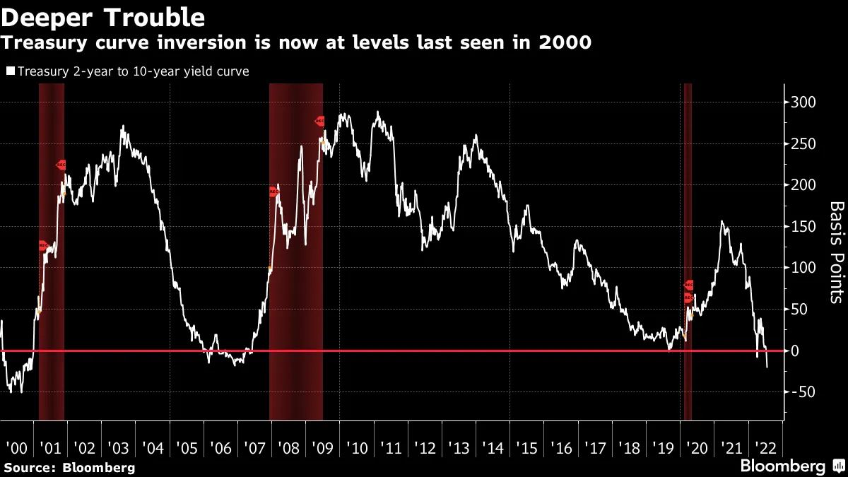
Every few years, the bond market produces a signal so stark that it floods the financial press, dominates trading room conversations, and then promptly gets misunderstood by the majority of people discussing it. The yield curve inversion that began in the summer of 2022 was precisely that kind of event. For nearly two and a half years, one of the most historically reliable recession indicators sat in plain sight — deeply negative, stubbornly persistent — while commentators argued about whether it still meant anything. Now that the curve has normalised, the question is no longer whether you noticed the inversion. The question is whether you know what to do the next time one appears.
The yield curve is not a trader’s tool in the way that a moving average or a relative strength reading is. It does not tell you to buy this stock or sell that index on any particular day. What it does instead is something arguably more valuable: it tells you where the bond market — the largest and most liquid financial market on earth, populated by the most sophisticated institutional investors in existence — collectively believes the economy is heading over the next twelve to twenty-four months. Getting comfortable with what the curve is saying, and why, gives the active trader a genuine edge in calibrating risk and positioning size across market cycles.
The Architecture of Borrowing Costs
Before you can read the yield curve, you need to understand what it actually is. A yield curve is simply a chart plotting the interest rates — known as yields — offered by government bonds of the same issuer but with different maturity dates, arrayed from shortest to longest across a horizontal axis. In the United Kingdom, those bonds are called gilts and are issued by HM Treasury. In the United States they are called Treasuries and are issued by the US federal government. The curve can be read for any sovereign issuer, but it is the US Treasury curve and the UK gilt curve that carry the most signal relevance for global equity traders.
Under normal economic conditions, the yield curve slopes upward from left to right. A one-month gilt yields less than a two-year gilt, which yields less than a ten-year gilt, which yields less than a thirty-year gilt. This is intuitive once you consider the underlying logic. If you lend your money to the government for one month, the risks are minimal: inflation is unlikely to move dramatically in that window, and you get your money back very quickly. Lend for thirty years, and the picture changes entirely. You are locked in for three decades during which inflation might erode the purchasing power of your repayment, governments might change, central bank policy might shift in ways no one can anticipate, and you simply want more compensation for that uncertainty. That additional compensation is called the term premium, and in a healthy economy it ensures that longer-dated bonds always yield more than shorter-dated ones.
The spreads that traders and analysts watch most closely are the 2-year versus 10-year spread (commonly written as the 2s10s) and the 3-month versus 10-year spread. Each measures the difference in yield between a short-dated instrument and a long-dated one. When the 10-year yield is higher than the 2-year, the spread is positive and the curve is said to be normal, or positively sloped. When that relationship reverses — when the 2-year yield rises above the 10-year — the spread turns negative and the curve is said to be inverted.
An inversion is not a quirk of data. It is a deliberate signal produced by the collective behaviour of millions of institutional bond market participants. When investors pour money into long-dated bonds and drive their yields below short-dated ones, they are not making a mistake. They are saying, explicitly, that they expect interest rates to fall in the future — and interest rates tend to fall when central banks cut them in response to a slowing economy. The inverted curve is, at its core, the bond market pricing in economic weakness ahead.
A Signal With Deep Roots
The yield curve’s reputation as a recession predictor did not emerge from a single dramatic episode. It was assembled slowly over decades, each inversion followed by contraction, each episode adding another data point to a remarkably consistent historical record. Academic research formalised what practitioners had observed informally since at least the mid-nineteenth century. Graphical evidence from as far back as 1858 showed that the term spread between short and long rates tends to turn negative near cyclical peaks — the moments in the economic cycle when expansion is exhausting itself before turning to contraction.
The modern analytical framework was largely established by the Canadian economist Campbell Harvey, whose 1986 doctoral thesis at the University of Chicago formalised the relationship between the slope of the yield curve and subsequent economic growth. Harvey’s work gave practitioners a rigorous theoretical foundation for something they had long suspected empirically. The Federal Reserve Bank of New York subsequently built a formal recession-probability model using the 3-month to 10-year spread, and that model became one of the most closely watched outputs in institutional macro analysis.
The record that emerged from this research is striking in its consistency. The yield curve inverted in the late 1960s ahead of the slowdown of 1969 and 1970. It inverted in 1978 and again around 1980 ahead of the back-to-back recessions of that era. It inverted in the late 1980s, with the 2-year yield exceeding the 10-year by the end of 1988, and the United States entered recession in July 1990. The inversion of 2000 preceded the technology-bust recession of 2001. The curve that flattened and then inverted between mid-2006 and mid-2007 produced perhaps the clearest signal in modern history — pointing directly at the financial crisis of 2007 to 2009 that proved to be the worst economic contraction since the Great Depression. An inversion in August 2019 preceded the recession of early 2020, even if the trigger proved to be an exogenous shock in the form of the Covid-19 pandemic rather than a purely endogenous economic deterioration.
— INSERT IMAGE BLOCK HERE —
Suggested image: A clean editorial illustration or TradingView screenshot showing the US 2-year vs 10-year yield spread going deeply negative in 2022 and recovering to positive territory by late 2024. Light mode, white background.
What makes the record particularly compelling is that the false-positive rate is extremely low. There have been two meaningful exceptions over the past sixty years. A brief inversion in late 1966 was not followed by a recession within the standard lead-time window. A very shallow inversion in 1998, during the Russian debt crisis and the near-collapse of Long-Term Capital Management, was unwound quickly enough by Federal Reserve easing that it arguably never fully materialised as a confirmed inversion signal — though a recession did follow in 2001, within a reasonable lag period. The rule of thumb that emerges from this history is that every significant, sustained yield curve inversion since the Second World War has been followed by a recession within six to twenty-four months.
How an Inversion Actually Works
Understanding the mechanics behind an inversion makes the signal far more useful than treating it as a black-box indicator. There are two interconnected forces at work whenever the yield curve inverts, and it helps to think about both of them simultaneously.
The first is the actions of a central bank. When inflation runs high and the economy is running hot, central banks raise short-term interest rates aggressively. In the United Kingdom, that means the Bank of England raising its Bank Rate, which directly influences the yields on short-dated gilts. In the US, it is the Federal Reserve raising the federal funds rate. Because short-dated bond yields are tightly anchored to the prevailing policy rate, when the central bank hikes rapidly — as both did between 2022 and 2023 — the front end of the yield curve rises sharply. The Bank of England took its Bank Rate from 0.1 per cent in December 2021 to 5.25 per cent by August 2023. The Federal Reserve raised the federal funds target rate by more than five percentage points over the same broad period. Short-dated yields followed those hikes almost in lockstep.
The second force is the bond market’s own assessment of where rates will be in the future. Long-dated bond yields are not pinned to today’s policy rate. They reflect the market’s expectation of what the average short-term rate will be over the life of the bond. If you believe rates will be lower in five years than they are today — because you expect the economy to slow and force the central bank to cut — you will accept a lower yield on a ten-year bond than on a two-year one. When central banks hike aggressively, they are, by definition, tightening financial conditions in ways that reduce economic growth. The bond market, watching this happen, concludes that the tightening will eventually cause a slowdown, which will require future rate cuts, which makes long-dated bonds more attractive, which drives their yields lower. The front end goes up because central banks are forcing it there. The back end stays lower — or rises more slowly — because the market is already looking past the hikes to the cuts that typically follow.
This is the mechanism behind every inversion. The central bank tightens. The bond market front-runs the eventual easing. The curve inverts. And historically, the easing that the bond market is pricing in does indeed arrive — typically because the tightening does its job of slowing the economy to the point where growth becomes the primary concern rather than inflation.
The Three Shapes of the Yield Curve
Normal (positive slope) — Long-term yields exceed short-term yields. Reflects healthy growth expectations and a normal term premium. Banks profit from the spread between borrowing short and lending long, which supports credit creation and economic activity.
Flat — Short and long yields are close together, with little gradient across maturities. A transitional shape, often seen when the curve is either about to invert or recovering from an inversion. Indicates uncertainty about the economic direction rather than a clear signal either way.
Inverted (negative slope) — Short-term yields exceed long-term yields. The term premium has disappeared and the market is pricing in future rate cuts. Historically the most reliable leading indicator of economic contraction available to traders and investors.
The shape of the curve also matters for the banking system in ways that directly affect the broader economy. Banks operate on the basic model of borrowing at short-term rates and lending at long-term rates — collecting the spread between the two as profit. When the curve is steep and positively sloped, this model is highly profitable and banks are incentivised to extend credit generously. When the curve inverts, that spread disappears or turns negative. Banks become reluctant to lend because the economics of lending deteriorate. Credit conditions tighten across the economy. Businesses find it harder to borrow for investment. Consumers face more restrictive mortgage and loan terms. This is one of the channels through which a yield curve inversion transmits its effects into the real economy, turning the bond market signal into an economic reality.
— INSERT IMAGE BLOCK HERE —
Suggested image: A stylised diagram or TradingView screenshot illustrating the three yield curve shapes — normal, flat, and inverted — with clear labelling. White background, light mode.
There is a further nuance that even experienced traders sometimes overlook: the un-inversion can be as important a signal as the inversion itself. When the curve re-steepens after a period of inversion, it can do so in two very different ways. A bull steepener occurs when short-term yields fall faster than long-term ones, typically as a central bank begins cutting rates — a sign that monetary easing has started in earnest. A bear steepener occurs when long-term yields rise faster than short-term ones, driven by fiscal concerns, inflation expectations, or a rising term premium — a more ambiguous signal that can reflect concerns about debt sustainability rather than a straightforward return to economic health.
Historically, the bull steepener that follows an inversion tends to coincide with the period of greatest economic vulnerability. The recession that the original inversion was forecasting has not yet arrived — or is only just beginning — when the curve starts to normalise. The inversion, in this reading, is the warning. The un-inversion is the starting gun.
The 2022–2024 Inversion and What Followed
The inversion that began in July 2022 immediately distinguished itself from any that had come before it. By the time the 2-year yield crested above the 10-year yield in the summer of 2022, inflation in both the UK and the US was running at multi-decade highs. The Bank of England and the Federal Reserve were both in the midst of the most aggressive tightening cycles since the early 1980s, pushing short-dated yields sharply higher while the long end of the curve remained comparatively anchored by the bond market’s conviction that this level of tightening would eventually be reversed.
The inversion that followed was not shallow or fleeting. It deepened substantially through 2023, with the spread between US 2-year and 10-year Treasuries reaching levels not seen since 1981 — at its deepest, the second most severe inversion on record. The 3-month to 10-year spread, which the New York Fed uses in its formal recession model, turned negative in October 2022 and remained there for over two years. From October 2022 until December 2024, 3-month US Treasury bill yields exceeded those on 10-year notes without interruption — the longest sustained inversion going back at least forty-five years.
And yet, uniquely in the post-war record, no recession arrived. The US economy grew at 2.9 per cent in 2023 and accelerated further in 2024. The UK avoided a deep contraction, recording only a very shallow technical recession in late 2023 before recovering. Unemployment remained historically low in both countries. Consumer spending proved resilient. The signal that had preceded every recession since the 1950s — with only trivial exceptions — appeared, for the first time, to have misfired on a significant scale.
The explanations offered by economists for this anomaly are numerous and not all of them are convincing. The most credible centre on structural changes in the economy that made the 2022–2024 cycle less rate-sensitive than previous ones. Many households had locked in fixed-rate mortgages at the ultra-low rates of 2020 and 2021, particularly in the United States, and so were insulated from the immediate impact of the tightening. Large corporations had similarly refinanced their debt at low rates before the hike cycle began, reducing their exposure to the higher cost of new borrowing. Unusually elevated government spending — a structural shift partly attributable to the legacy of pandemic fiscal policies — provided a persistent tailwind to demand that previous cycles had not enjoyed.
There is also the question of timing and patience. The average lag between the start of an inversion and the beginning of a recession has historically been twelve to twenty-four months, and the 2022 inversion lasted so long that the clock was always somewhat ambiguous. The un-inversion itself — when the curve began normalising in late 2024 as the Fed started cutting rates — revived the debate, because historically it is after the inversion ends, not during it, that economic weakness most commonly arrives. The verdict on this cycle is not yet fully written, even if the headline economic data has so far been resilient.
For the UK, the parallel story is instructive. UK gilt yields also inverted during this period, with shorter-dated gilts yielding more than longer-dated ones as the Bank of England pursued its own aggressive tightening cycle. The UK economy experienced its own version of the same tug-of-war between the signal and the data, with growth underwhelming but not collapsing in the way that deep inversions had historically suggested. The Liz Truss government’s mini-budget of September 2022 added its own extraordinary volatility to the gilt market, briefly sending long-dated yields sharply higher before calm was restored — a reminder that the gilt curve can be distorted by political and fiscal events that lie outside the scope of any purely monetary framework.
— INSERT IMAGE BLOCK HERE —
Suggested image: TradingView chart of the US 10-year Treasury yield vs the 2-year Treasury yield from 2021 to 2025, showing the inversion and subsequent normalisation. Light mode, white background.
The chart below shows how the US 2-year versus 10-year spread moved through the inversion cycle, using stylised approximations of the key turning points and depth of the spread at each stage of the cycle.
+50
0
–50
–100
Positive spread (normal curve)
Negative spread (inverted curve)
Returning to positive (un-inversion)
Reading the Curve as a Working Trader
The yield curve’s track record makes it worth embedding into any trader’s macro framework, but it needs to be used correctly. Several practical principles emerge from the historical record that are worth internalising before the next inversion cycle begins.
The first principle is that the curve is a leading indicator of economic conditions, not a timing tool for the market. The average lag between a yield curve inversion and a recession has historically been twelve to twenty-four months. Equity markets do not wait for the recession to be officially declared before they begin pricing it in — they tend to peak and begin declining during the lag period — but the relationship is not precise enough to generate reliable entry or exit signals on individual trades. What the inverted curve should do is raise your awareness, shift your risk management, and prompt you to think more carefully about the macro environment your trades are operating in. A trader who enters aggressively leveraged long positions in growth stocks during a deeply inverted curve environment is not taking a calculated risk. They are ignoring the macro framework entirely.
The second principle is to watch both the inversion and the un-inversion. Based on the historical record, recessions have consistently begun not during the inversion itself but in the period immediately following the re-steepening of the curve. When the curve normalises because the central bank has begun cutting — a classic bull steepener — that is not necessarily a signal of all-clear. It may indicate that the slowdown the inversion was predicting has finally arrived and the central bank is now responding to it. The speed and character of the un-inversion matter. A gradual steepening driven by improving growth expectations tells a different story than a rapid normalisation driven by emergency rate cuts.
The third principle is to understand the limitations alongside the strengths. The 2022–2024 cycle demonstrated conclusively that the yield curve is not infallible. The structural arguments for why this particular inversion did not produce a recession — the prevalence of fixed-rate mortgages, pre-funded corporate balance sheets, persistent fiscal stimulus — may or may not apply with the same force in future cycles. Markets evolve. Relationships that held for decades occasionally break down or delay. A trader who treats any single indicator as an automatic, mechanical trigger is applying the wrong framework. The yield curve informs judgement. It does not replace it.
There is one final observation worth carrying into any future inversion cycle. The depth, duration, and context of an inversion all matter. The shallowest inversion on record — a mere nineteen basis points in 2006 — preceded the worst financial crisis in a generation. The deepest in forty years, in 2022–2023, apparently produced no recession at all. The lesson is not that the signal is inconsistent. It is that the signal is probabilistic and nuanced, shaped by the specific economic architecture of each cycle. Traders who take the time to understand both the theory and the history behind the curve will be far better placed to interpret the next signal when it arrives than those who have only encountered the term in a headline and moved on.
The yield curve is not a crystal ball. But it is the closest thing to a collective forecast that the world’s most sophisticated and deep-pocketed investors produce — and in a discipline where genuine forward-looking information is difficult to come by, that makes it worth understanding thoroughly and watching consistently.
About the Author